In Memory of Alan Bartram, 1932-2013: Writer, Book Designer and Artist
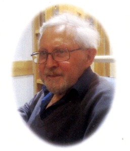
Alan Bartram, who has died at the age of 80, was associated with Lund Humphries for many years, initially as author and designer of a series of books on typography and lettering, and from the late 1980s as graphic designer of many of our exhibition catalogues, artist monographs and catalogues raisonnés.
At his funeral, I discovered that he had also been a very talented painter – a talent which he was extremely modest about, never wishing to promote or sell his work.
Between December 2010 and February 2011, Alan sent me various versions of what he hoped might become a memoir of our mutual colleague and friend John Taylor (1932-2010), longstanding director of Lund Humphries, which he suggested we publish under the title ‘An Art Book Publisher’. For various reasons the project never materialised, but I still have his wonderful typewritten drafts, annotated by hand with Tippex and brown ink, which say much about Alan’s own approach to book-design and his nostalgia for a less commercial age in book-publishing. They are episodic memories, from which I reproduce extracts below.
It appears from these notes that Alan’s first association with Lund Humphries took place over forty-five years ago:
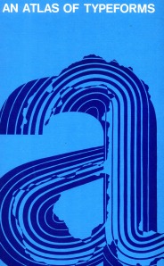
In 1967 James Sutton and I submitted a project to John Taylor at Lund Humphries. We explained that our ideas required a format of 16 x 10 inches as we called it then, or 406 x 254 mm. John barely blinked. In those days there was no need to consult ‘Marketing’ or ‘Production’. Trusting his own judgement he decided it was an idea worth proceeding with. It eventually resulted in the notorious An Atlas of Typeforms, which fitted nobody’s bookshelves and which booksellers hated for its size. Yet it became a classic while simultaneously becoming out-of-date, for it dealt with metal types just as filmsetting was replacing them. We had not realised at the time how quickly this would happen.
Alan’s introduction to Lund Humphries had been brokered by Herbert Spencer:
I had been an assistant to Herbert Spencer, LH’s designer and consultant, and it was he who introduced James [Sutton] and me to John. That team of John Taylor / Herbert Spencer was an exceptional combination for the time, and probably nothing similar exists today. It came about because LH – an unusually enlightened printer – had appointed Herbert as typographic consultant in 1950, nine years before John joined the publishing side. […] Thus when John joined LH he had this mysterious being, a design consultant, already in place. […] Having collaborated so happily with Herbert for 26 years John knew well the pleasures and problems of working with designers. Being introduced to him by Herbert, both as an author and as a designer, had long-lasting consequences in my own life, resulting in a 35-year working relationship and permanent friendship.
Between 1975 and 1986, Lund Humphries published Alan’s series of books on lettering:
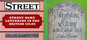
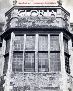
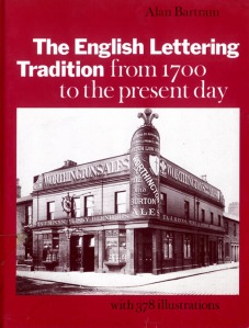
[John] was happy to go out on a limb, as with my lettering books. At the time the only two general contributions to the subject were Nicolete Gray’s Lettering on Buildings and a major article by James Mosley in the periodical Motif. John saw a gap. After Lettering in Architecture [1975] I produced, a few years later, photographs for what I had conceived as a book on fascia lettering, tombstones, street name lettering and so on. John saw possibilities for a series of smallish paperbacks on individual subjects. [These were published in 1978 as Fascia Lettering; Tombstone Lettering in the British Isles; and Street Name Lettering in the British Isles.] Publishers like a series. Later still, in 1986, a culminating volume embracing an even wider range of examples was published [this was The English Lettering Tradition from 1700 to the Present Day].
Alan’s memoir discusses how book design was affected by the shift during the 1970s from letterpress printing, which demanded that illustrations be printed separately from the text and placed in sections within the book, to offset lithography, which enabled text and illustrations to be integrated:
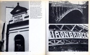
My lettering books [… ] were integrated and could not have been done any other way. I first organised the sequence of photographs, grouped them into thematic pages, then wrote the captions. These referred directly to the illustrations I was showing on each spread, but they ran on from page to page to form a continuous text. Although picture-led, the text is equally important, the design in my mind as I was writing it: the advantage of being a designer-writer is that text and page layout can be organised together to fit.
Alan started to do pure book-design work for Lund Humphries following Herbert Spencer’s departure from the firm in 1986:
The first major design job I did for LH was the catalogue for an exhibition at the Barbican Art Gallery in 1987: A Paradise Lost, the Neo-Romantic Imagination in Britain 1935-55. Right up my street, with a most sympathetic and appreciative curator in Dr David Mellor. John has said he found some difficulty in keeping up with up-to-the-minute contemporary art, and so did I. Conceptual art lives in another world from mine.
During the 1990s Alan worked with John and me on many artist monographs – and often had strong views on the artist’s work:
Designing monographs on artists is usually easier if they are dead, and without relations who believe they have a hotline to the artist’s spirit. But working with living artists brought its own pleasure, even if you often had to give way, or compromise, to their ego […] Artists usually seem to possess strong personalities and/or interesting characters … Terry Frost was a ‘character’, but I dislike his work so much I thought it wiser to withdraw from the project.
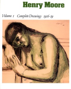
The last major project which Alan worked on for Lund Humphries was the complete catalogue of Henry Moore’s drawings, published in association with The Henry Moore Foundation in seven volumes between 1994 and 2003. It seems now to mark the end of a particular era in book design and production:
With Henry Moore Drawings we were lucky with our timing. The lengthy period over which the seven volumes were produced commenced before such work was regularly sent to the Far East. It is difficult to believe that, with their thousand or so illustrations per volume, they would have been as painlessly produced there as they were by BAS at Over Wallop. I am still a galleys and paste-up man, and we worked out an efficient system that everyone was happy with, including the Foundation. If need be, they were able to pull off pasted-up illustrations and switch them around. The paste-up being full size we could all see what the final result would look like.
Alan never converted from being a ‘galleys and paste-up man’ to computer-aided design, but I always felt that he was quite happy for technology to overtake him. He enjoyed the restraints of traditional design techniques, writing that ‘For those brought up in a more austere and disciplined tradition, the liberties taken with typesetting today can be disturbing’. Thanks to Alan’s legacy, the spirit of disciplined design, typographic clarity and the successful ‘engineering’ of text and illustrations lives on in the Lund Humphries list today.
Lucy Myers, Managing Director
